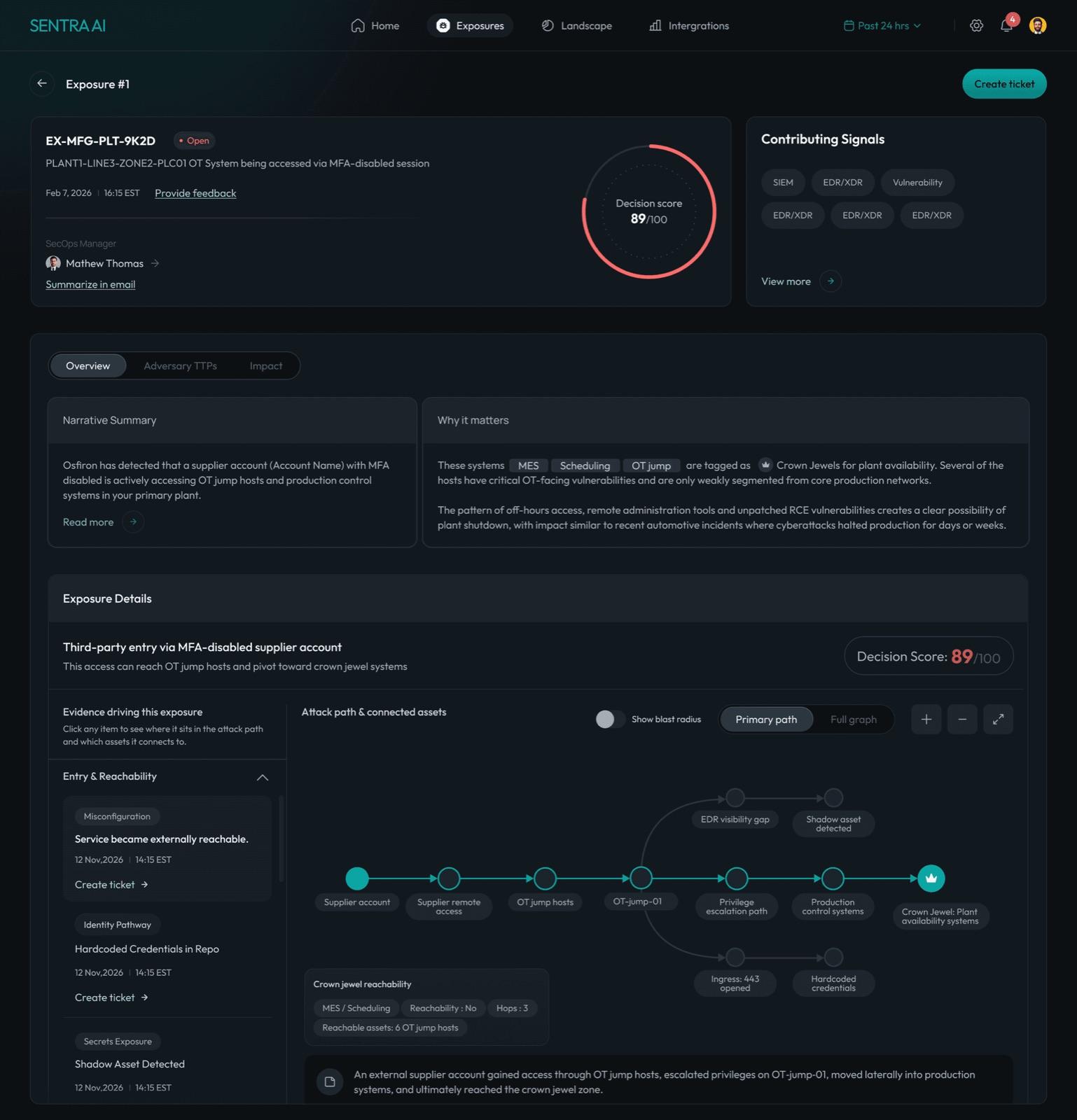
Making thousands of signals feel like a few decisions
Correlates vulnerabilities, identities, misconfigurations, and live threat signals — condensing fragmented alerts from 12+ tools into a handful of prioritized exposure decisions.
- My role
- Product Designer
- Timeline
- 2 Months
- Team
- 2 Designers
- Scope
- 4 product areas
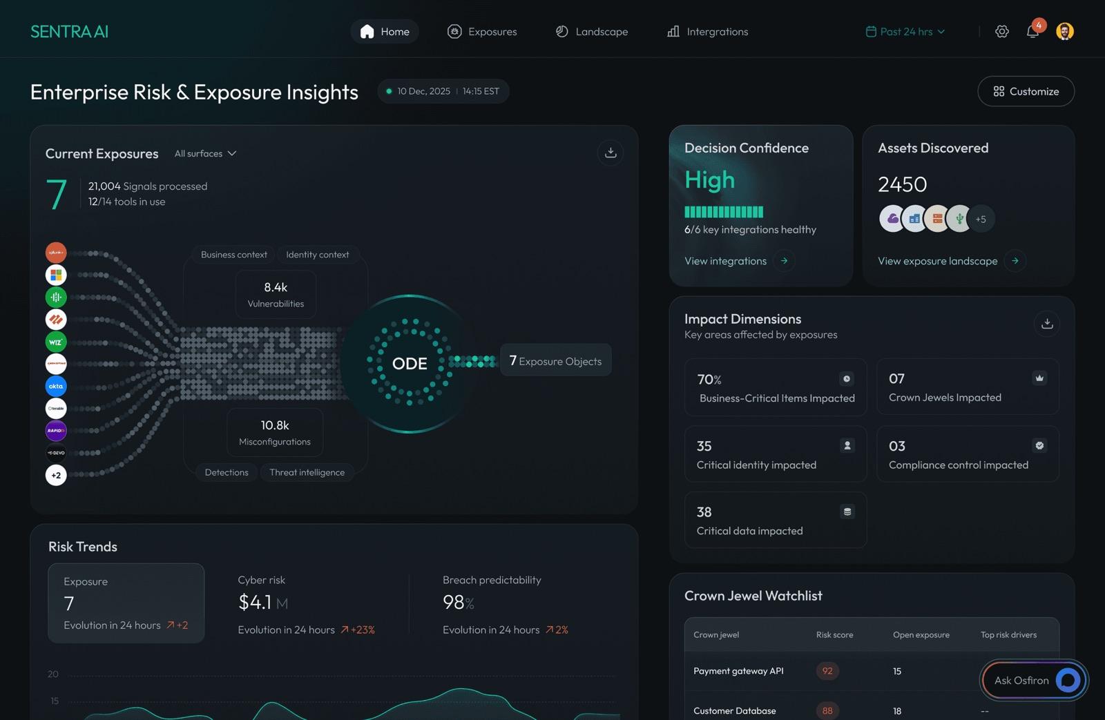
My part
I owned UI design across all four sections of the platform — Dashboard, Exposures, Landscape, and the AI co-pilot. I wasn't leading product strategy or conducting user research. Every visual and interaction decision that shaped how users experienced the product was mine.
CH 01Context
Thousands of alerts. No shared context.
It's 8am. An analyst opens the dashboard to alerts from 12+ tools — vulnerabilities, identities, misconfigurations, live threats — and no way to tell which one matters first.
Sentra AI is an enterprise cybersecurity platform that correlates vulnerabilities, identities, and threat signals into prioritized exposure decisions. Instead of reviewing thousands of isolated alerts, analysts investigate prioritized risks with business context.
For security analysts, the problem isn't a shortage of data, it's a shortage of clarity.
CH 02The wrong turn
My first instinct was to make it simpler. I was wrong.
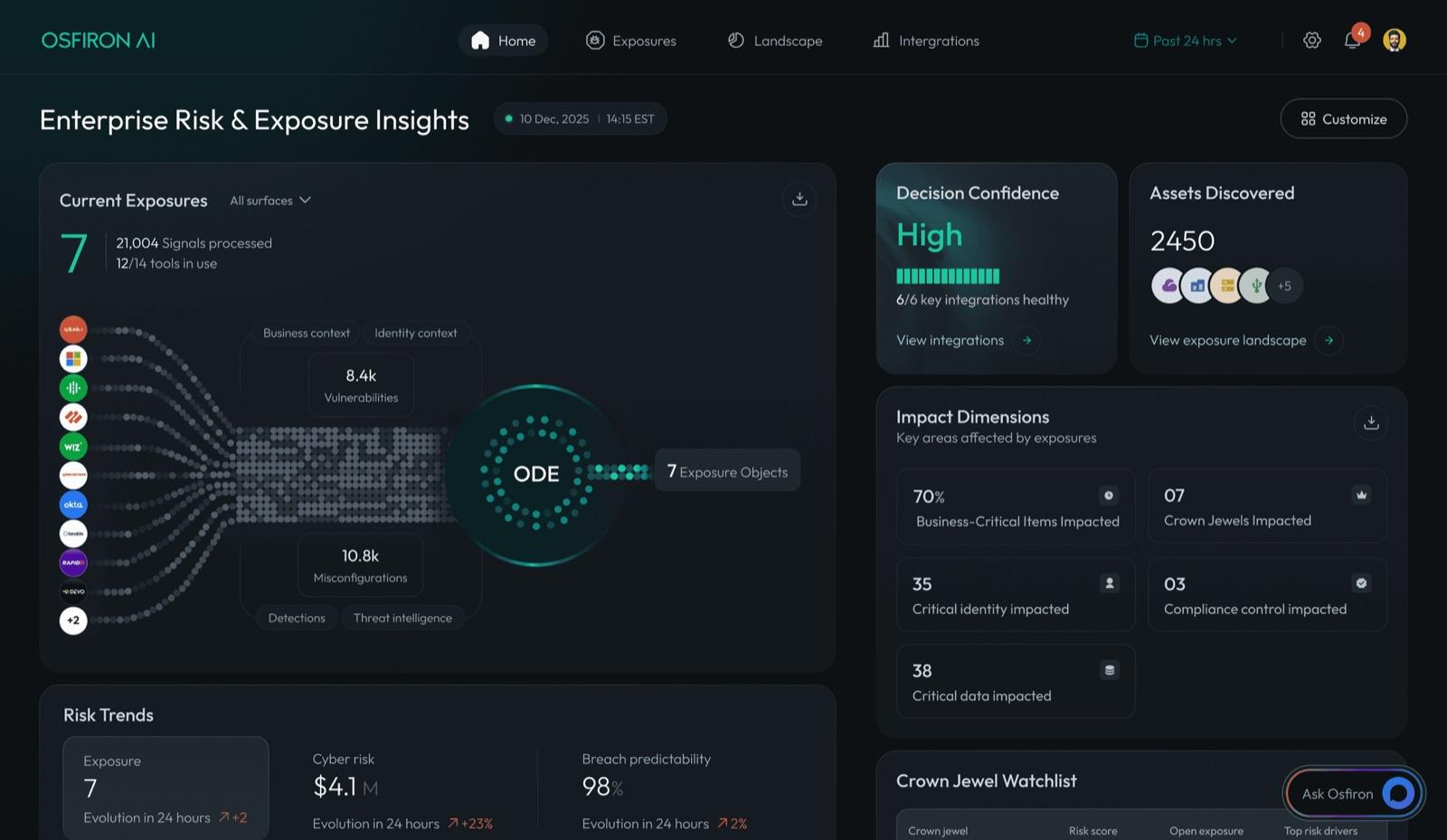
When I first mapped out all the data that needed to live on screen, I did what most designers would do — I tried to reduce it. Hide things. Create summary views. Show less upfront.
But after spending time understanding who actually uses this — security analysts, CISOs, SecOps leads — I realised the problem wasn't too much information. It was information with no hierarchy. No way to know what mattered most.
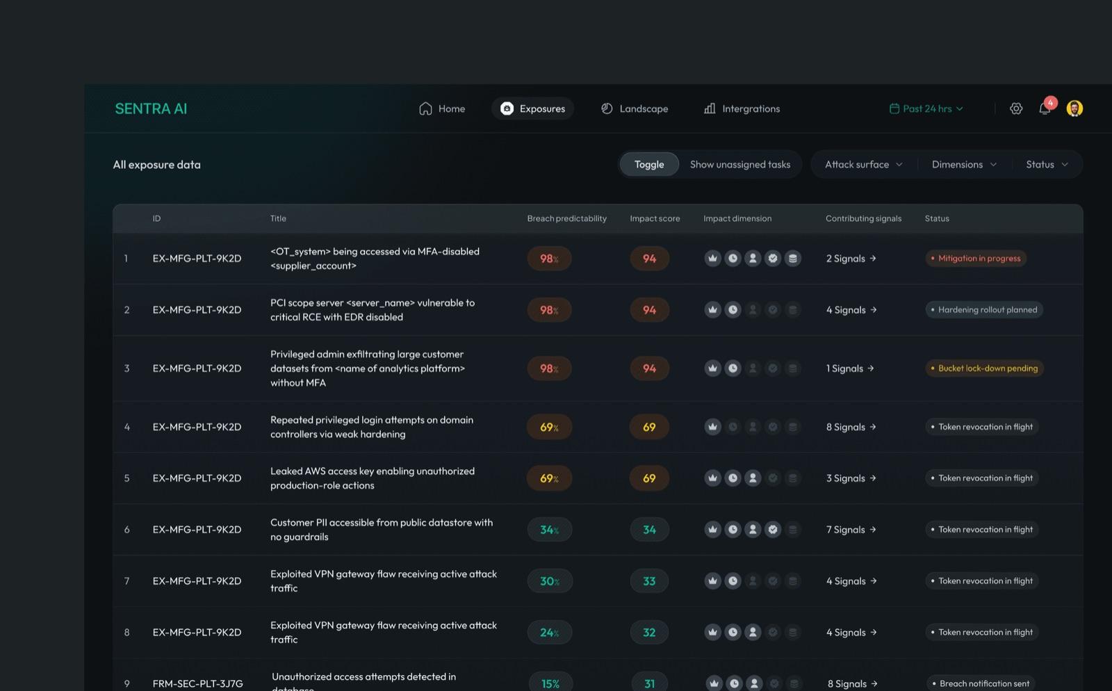
These users work long sessions. They need density. They need to scan a table and know in 2 seconds what's critical. The design challenge wasn't subtraction — it was hierarchy, contrast, and clarity at speed.
CH 03The rule
Density is a requirement. Familiarity is a feature.
Security analysts don't have time to learn a new interface. Every pattern had to be instantly readable. That constraint shaped every single layout decision I made across the product.
CH 04Decisions
Not what I designed, how I got there
Each decision below started from a version that didn't work. The story of how I got from that first version to what shipped is where the actual design thinking lives.
Decision 01
Progressive disclosure over full context upfront
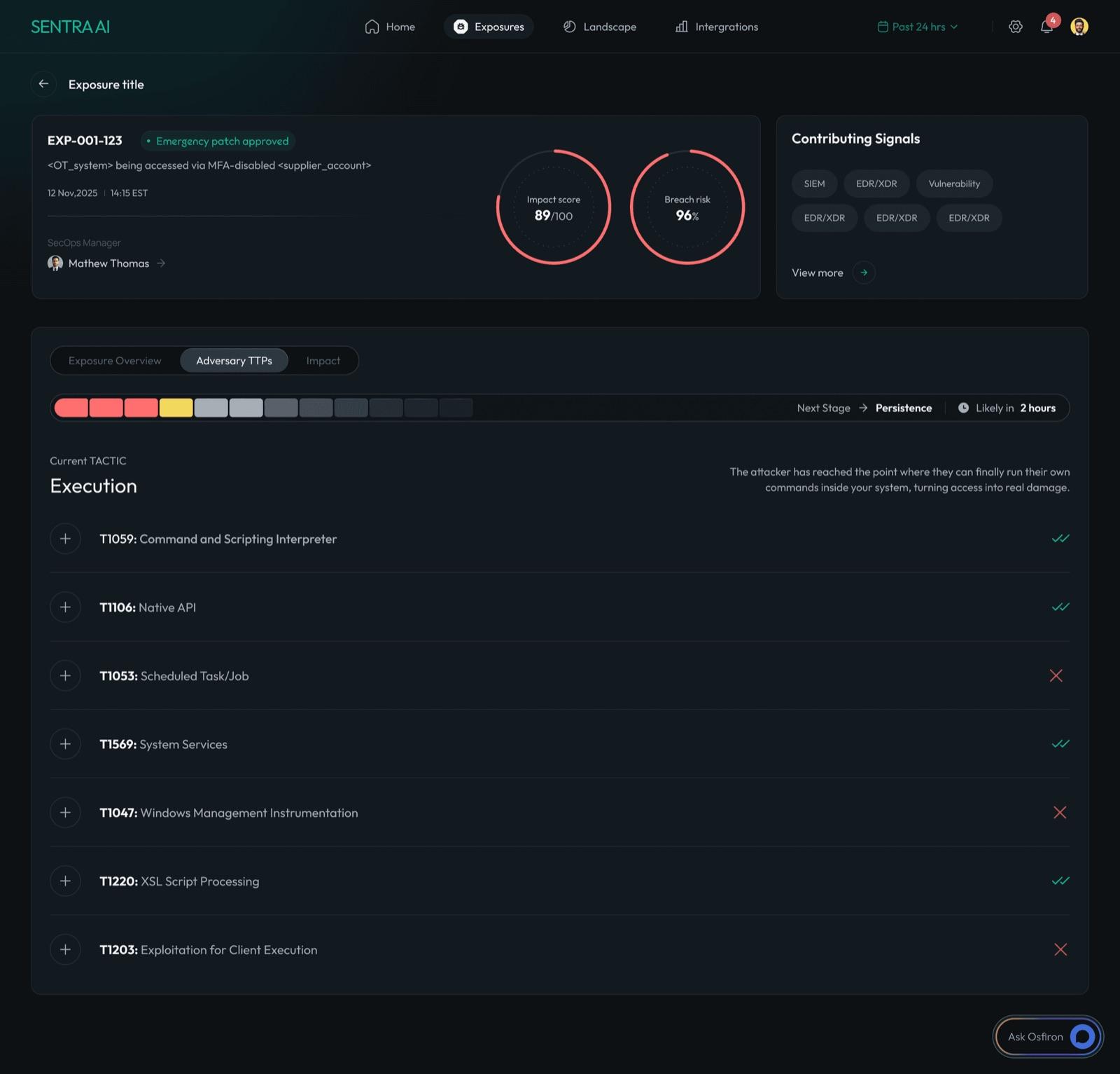
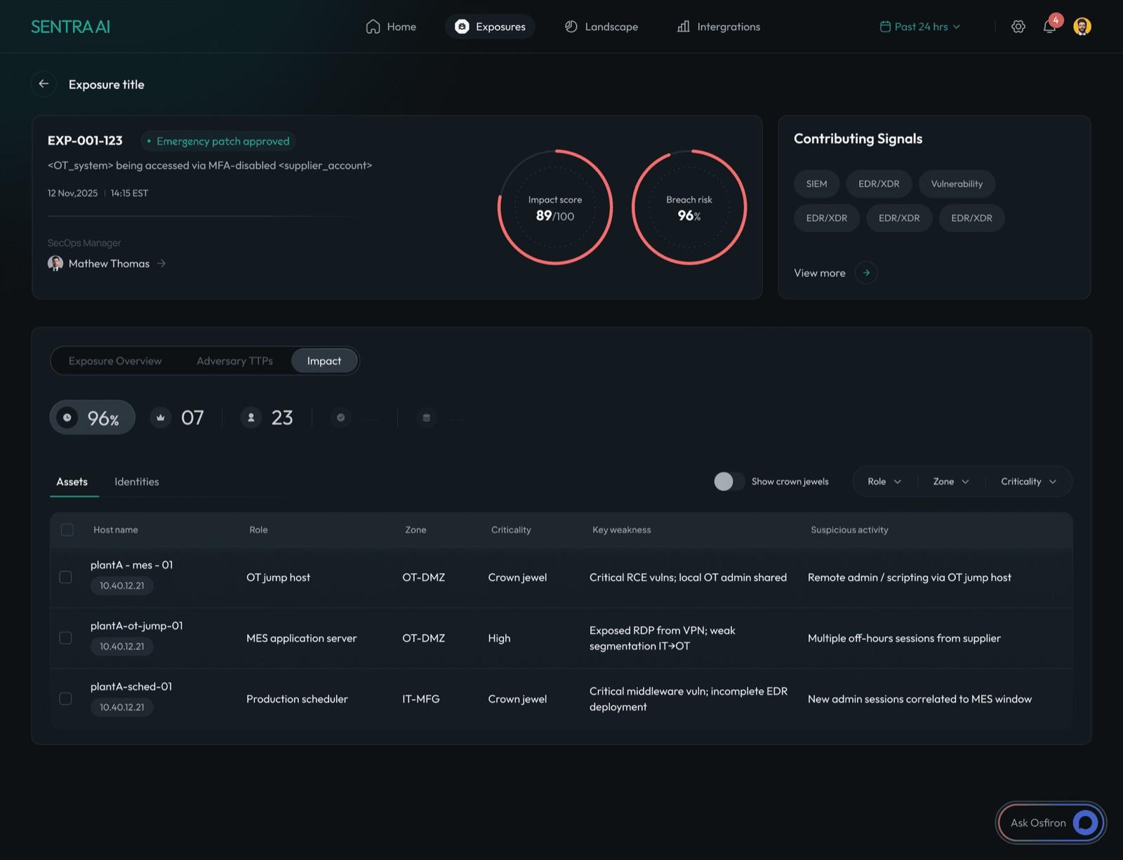
My first version of the exposure detail page showed everything — narrative, evidence, attack path, TTPs, impact — all on one scrolling page. It was complete. It was also overwhelming. A CISO looking at this at 9am doesn't need everything. They need the score and the one thing that matters most. I rebuilt it as four tabs. Each level earns the next.
Decision 02
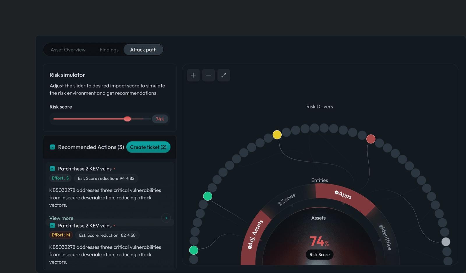
The risk simulator: making remediation feel actionable
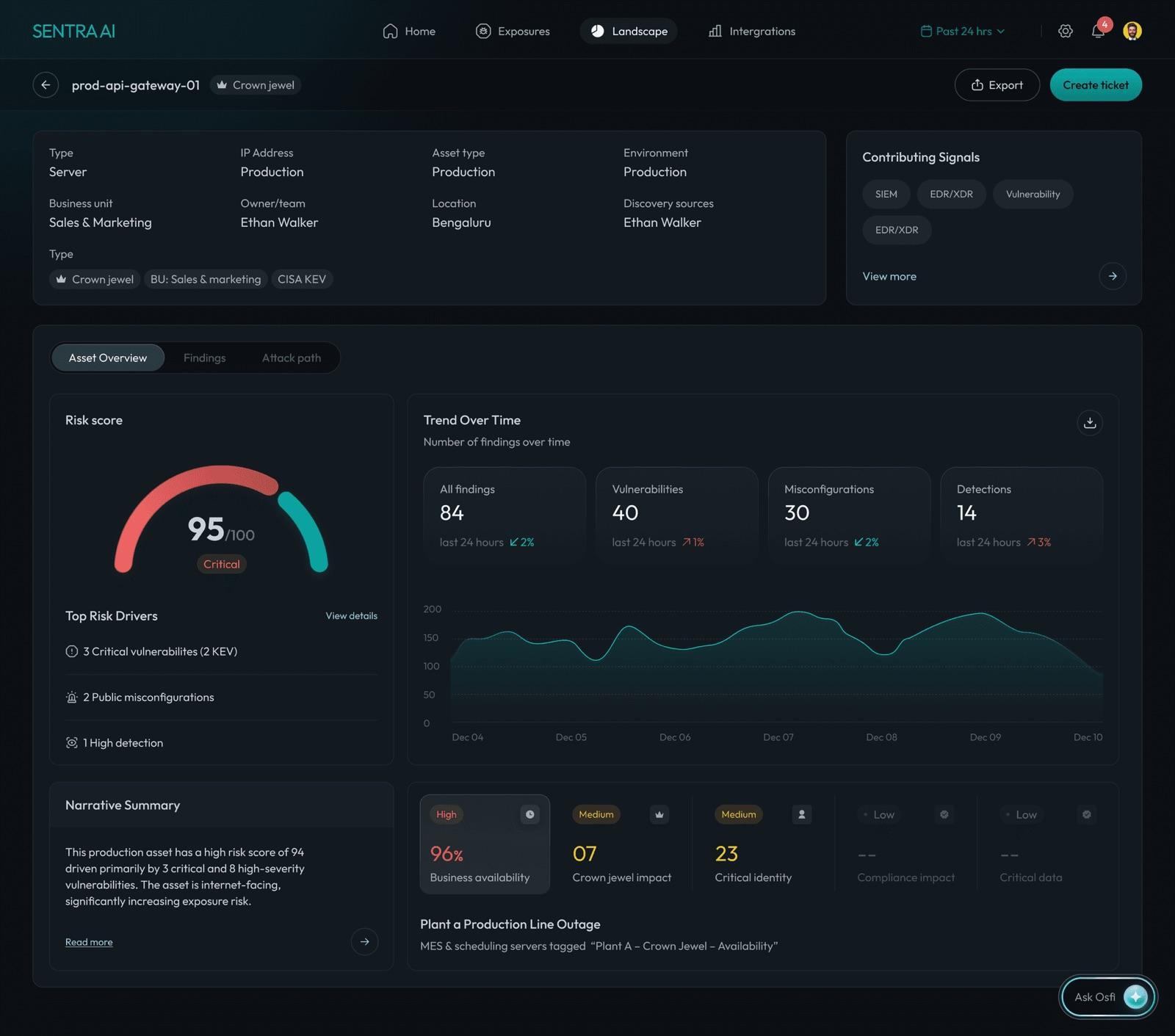
Security teams know their risk score is 95. They don't know which 2 actions bring it to 70. I explored showing a static recommendations list — but it still required mental math. The slider changed everything. Set the score you want. See which actions get you there, with effort level and score delta, before you commit to anything.
Decision 03
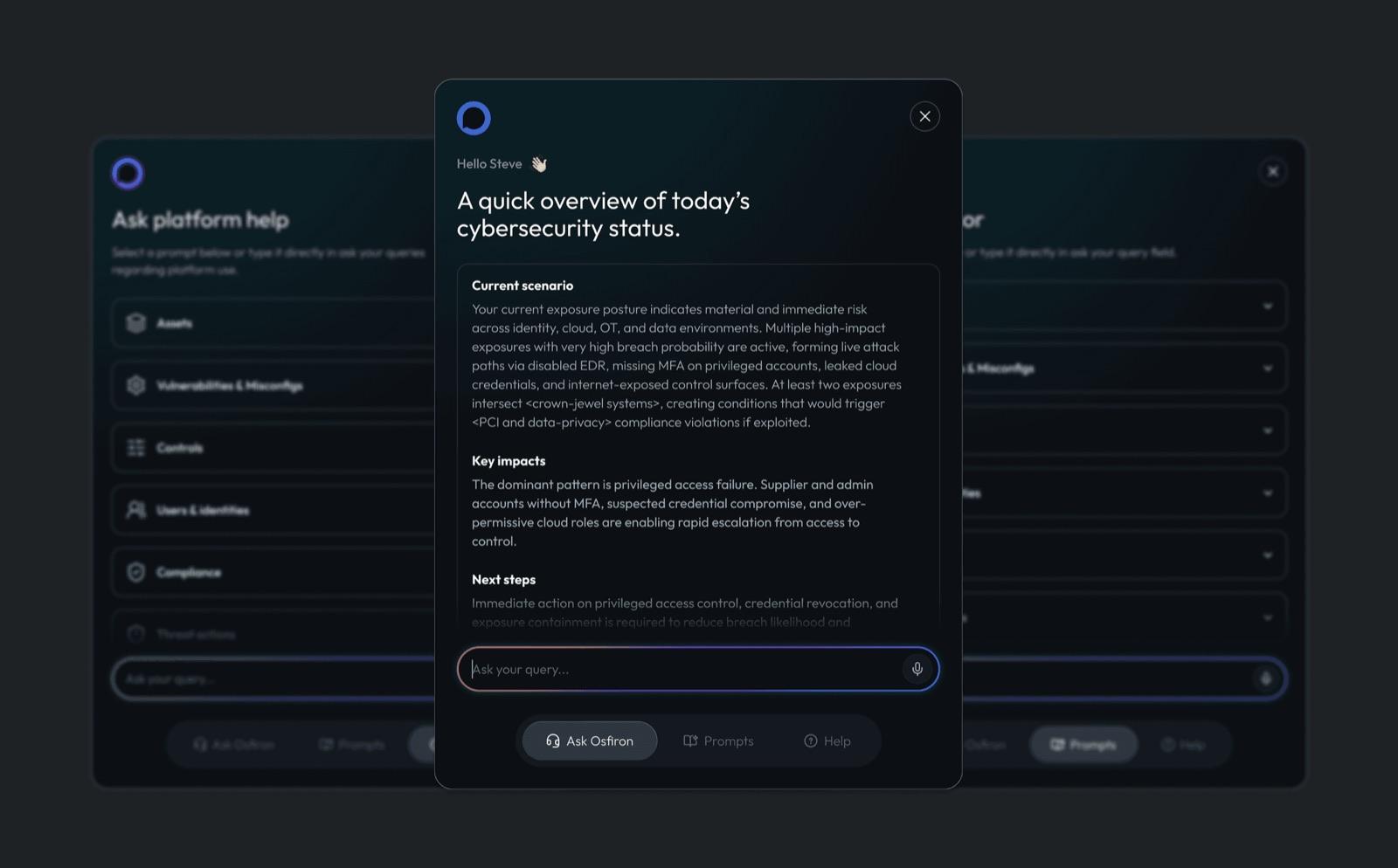
Proactive AI: open with a brief, not a blank prompt
The first version of Ask Osfi was just a chat interface. Clean, minimal, exactly what you'd expect. And it asked the user to do all the work. For a security analyst at 8am who doesn't know what to ask — a blank prompt is friction, not help. I designed it to open with a proactive security brief. The user gets value before typing a single character.
CH 05Takeaway
Show the one thing that matters first.
Every decision came back to the same rule. Progressive disclosure gives a CISO the score before the detail. The simulator turns a risk score into a plan. The brief gives analysts value before they ask. The density stayed — what changed was the hierarchy.
CH 06Screens
More from the product